In the spirit of bringing a little more geek into this UX party, this is the beginning of a second series I’ll be cycling through on Sword & Sharpie – Learn from games! In each post in this series, I’m going to pick a UI pattern from games and take a quick look at it. Let’s dig up some exotic wildflowers that bloom in the jungles of game design, shall we?
So here’s our first one—the radial menu!
So what is a radial menu?
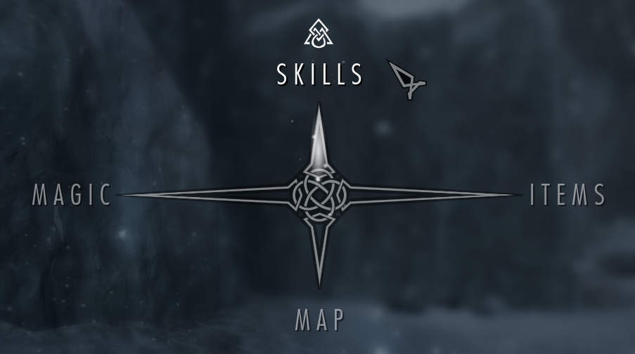
A radial menu is a menu of options that is displayed in a circle or semi-circle from some center. Sometimes the menu items originate from the specific spot and context a user interacted with. Other times, they can be summoned by a key or gesture and take over the whole screen, as in this menu from Skyrim. While not terribly circular, I still think it fits the bill.
When to use this pattern:
The radial menu design pattern is especially good in a number of particular situations:
- They are a natural choice to come out from under a finger on touch screens
Options are easy to reach. You can see them without moving your finger, and easily slide to make your choice. Ideally the menu should contain a small number of optins, so as not to be overwhelming—just the ones users use most frequently. What once could have been a multi-step process of opening a menu and making a choice can boil down to a single gesture. Taking this one step more…
- If users use a menu frequently to access certain options, they can develop muscle memory as a quick gesture to get to the option they want.
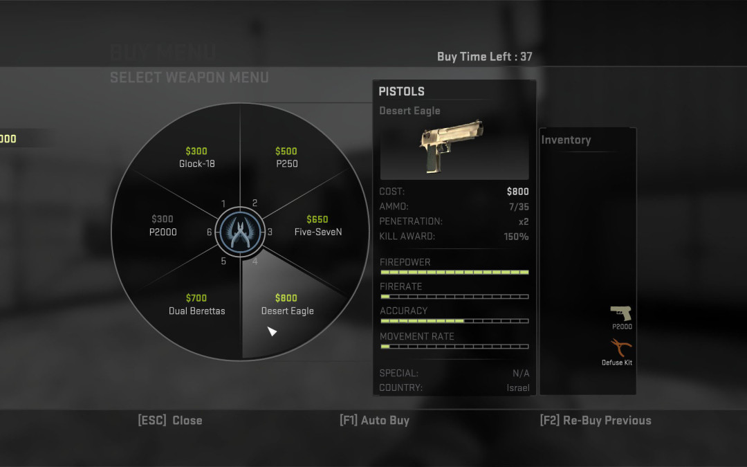
You know how you know where to put your fingers and type on a keyboard? That’s muscle memory for ya. In the game Counter-Strike: Global Offensive, players at the beginning of a round must quickly buy the weapons, grenades, etc. that they need for that round based on a limited amount of money. The buy window is very short—around 12 seconds or so. As they gain experience, most players have a set of weapons they prefer in certain types of rounds based on the strategy the team will use. The radial menu allows them to learn where these are and then flick their mouse to them quickly to buy the desired option. (Of course, key commands are an always popular alternative in this situation, too.)

You can’t achieve muscle memory level with just any set of menu options, though. In order to be a good fit for this pattern, a menu should have a fixed number of options. If the number of options is always changing, then the location of each menu will change and move. It should also be a relatively small number—say, less than 6. (Although you nest them as Counter-Strike does.)
The menu should serve as a quick way to get to an important, frequent option. It is not a good way to get to all the possible menu options for an application, for example.
- They add visual interest and delight.
For many of these examples, you could also choose a simple list menu or drop-down. But that wouldn’t be much fun, would it? For you or your users.
No, but seriously. Putting something like a radial menu shows a level of polish and passion on the part of a product team. It communicates that the makers of an application care about their users and giving them an awesome / wonderful / premium / luxury / delightful / fantastic experience.
So while the muscle-memory potential of a radial menu can make actions more efficient, the delight factor can also increase user satisfaction. Bonus!

Things to watch out for:
Here are a few considerations and issues to think about if you want to put this into your application tomorrow.
- Is there an affordance that indicates how to open the menu? If not, how will users know the menu is there? Will you use coach marks, or is it a lower priority interaction that may be okay for users not to discover? Is it a bonus affordance or is it necessary to get their job done?
- What exactly is the best gesture for your app and platform? Do users continue holding down and slide to an option? Or do they click or tap twice? Can your design work for both people who try sliding and people who try tapping twice?
- Keep animations quick and snappy. Don’t keep a user waiting for the menu to be ready.
- If you use icons, make damn sure they are intuitive and easily understood by everyone. Better yet, have them labeled somewhere in your app. Even better, include a label in the menu if there’s room.
What are your favorite (or least favorite) examples of radial menus?