I’ve spent quite a few hours of my life arguing over bugs. Weeks, months. Who knows how much it adds up to?
Did you know that people that identify bugs tend to rate severity dramatically higher than people who didn’t find them? So when you experience and report a usability issue or functional bug, you are much more likely to think it’s the worst thing that ever happened in the history of software. And when you go to tell someone about it, they are likely to consider it lower severity than you do—as well as lower than if they’d found the issue themselves. You can read more about the cognitive bias of in Measuring Usability on Google Books or buy the new edition.
The point is—prioritizing software issues is hard, subjective, and fraught with conflict.
You’d think you could just fix it, right? Make the bits flip the other way! But if you been there, you know, people might have an easier time electing a president. ;-]
Bugs can be difficult to prioritize, especially beyond the siren-blaring, app-crashing, user’s data is published on the wide-open internet kind. They can be ambiguous in scope. They can hide and only pop out when you’re the one looking—never for the developer. They can be important to some people and obscure to others. They can be shockingly painful only for a moment. They can be mildly irritating—and happen every 30 seconds.
That’s not to mention how exhausting it can be to sort through a dozen bugs, or a hundred, or many more. Decisions naturally get worse as everyone loses energy and willpower. Most issues touch multiple stakeholders, points of view, and often multiple pieces of code intersecting in unexpected ways.
As a designer, we’re often involved for the user’s point of view or as a product owner. In my early days working on triage, my best tool to provide the user’s point of view was storytelling. I’d paint a picture with words, set the stage for a dramatic scene about to go down. I’d tell the story of the heroic user, let down by our software, devastated or infuriated or frustrated or heart-broken. Hyperbole was a constant temptation. But it’s also an easy way to discredit yourself for the rest of the day, if not indefinitely.
Sometimes stories worked. Sometimes they didn’t.
Sometimes other people made dramatic technical arguments as well. Architectures would tumble. Failures would be utterly incorrect! How dare you make software that lies! Something would act in a way that didn’t quite match the way that its functions were structured. If architectures and UIs aren’t completely consistent—it means it doesn’t make sense!
To be frank, this worked most of the time. Even times when bug fixes were costly, and the changes made were completely invisible to the end user and not helpful to anyone, even our own team.
I was getting tired. I knew I couldn’t constantly monologue a three-act play by myself to convince people of my opinion about every single bug. If I had to do it several times in a row, it decreased in effectiveness quickly, although the bugs might all be quite serious. Also, I lacked great ways to communicate when I felt a bug wasn’t important. It was easy to verge on insulting someone’s opinion or intelligence, something I definitely did not want to do.
There had to be a better way.
The journey
I searched for a better way for a long time. Months turned into a year. Another developer was also on the same quest, and we searched the literature looking for something, anything that could help us make our bug prioritization make more sense. She and I knew intuitively it could be better. We knew intuitively the decisions coming out of the process were sometimes wrong. But how?
We found surprisingly little.
The first thing I remember finding that actually made sense was this:
- Improving Bug Triage with User Pain by Dan Cook, CCO of Spry Fox
For a few reasons, this process didn’t make sense for our team. (In particular, we were a large, distributed software team with many different teams within them. As an Army contractor, also, there were additional factors to consider that complicated matters at times.) I loved it dearly, though. If I ever have my own development team beyond my co-founders someday, I’ll definitely go for a process like this.
The next major resources I found on my journey was the book Measuring Usability. I devoured that book like my mom’s Thanksgiving dinner—quickly, delightedly, and going in for a second helping. This is one of less than five design books I have actually read cover to cover, like I would read a novel. (Normally I just pick and choose useful bits. Everyone I confess this too whispers agreement. A few books have even started acknowledging this as a worthwhile way to read the book in their intros. Yes, I often read the intros. What can I say, I’m a freak.)
And then…
Then I stubled on this humble blog post:
Important roads in London are known as ‘red routes’ and Transport for London do everything in their power to make sure passenger journeys on these routes are completed as smoothly and quickly as possible. Define the red routes for your web site and you’ll be able to identify and eliminate any usability obstacles on the key user journeys.
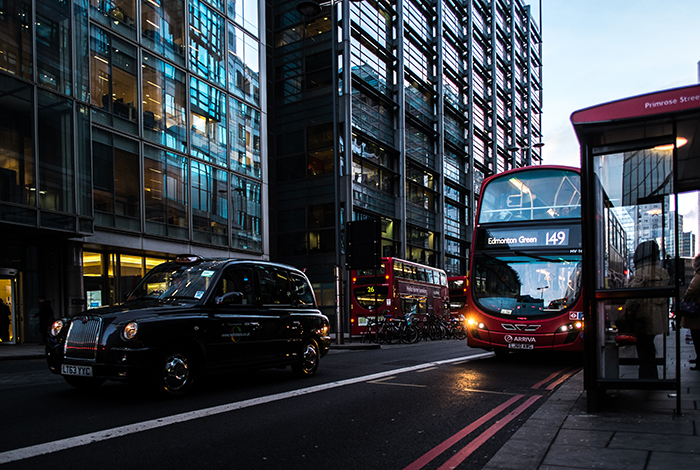
That picture up at the top? That’s a red route.
That’s right. This is a gigantic metaphor for knowing what your primary tasks are. But there’s something about the concreteness of it that moves people a heck of a lot more than if you just talk about “tasks.” It’s catchy. It gets people to do things. Branding, what can I say? It works.
And I mean, everyone hates traffic.
The concept is simple, but powerful. Which tasks are your system’s highways? Which tasks are your back country, dirt roads? Where does traffic form? What is that traffic costing you? What could be done to prevent it?
And THIS is traffic you can actually do something about, instead of just pounding your steering wheel!
Eureka!
Finally I had found something that helped. That made sense.
I began a long process of collaborating with every team in our organization to define the red routes for our system. For the system I worked on, which was a large piece of defense software nearing 10 years old, with many different ways for users to achieve a single goal, defining our red routes was not easy.
I surveyed a broad group of folks who had worked with users on what they had seen to be the most important user goals. This step turned out to be surprisingly easy, and in spite of different wordings, many people said variations on about 15 different goals. It took a lot of affinity mapping and word-smithing, but even my first draft was something most people could nod and agree with.
Getting shared agreement on how users actually clicked through the software to achieve those goals was harder and a lot more complex. Most of our red routes could have been achieved literally dozens of ways with our ultra-flexible software. In reality, of course, there were a handful of ways users really used most of the time.
Identifying those, articulating them clearly, and building consensus around them took a lot of work. But it was absolutely worth it. This process itself was a kind of education about end users for our team. This alone would probably have increased our effectiveness at triage (and development, too, for that matter).
After we had some understanding of this, I worked with a decision matrix I found on User Focus. I can’t find the original I used. This simpler tool appears to have replaced it, which may be even better! I started with the original decision matrix and modified it for our software and team. We iterated on it as we worked through bugs. Sometimes certain types of bugs came out as lower or higher than they seemed like they should. So we worked in additional checks over time, based on the type of problems that we frequently struggled to prioritize.
Here’s what we came up with. This creates a simple framework for discussion about bugs. It doesn’t end disagreements, but it makes them a whole lot more constructive and nuanced.
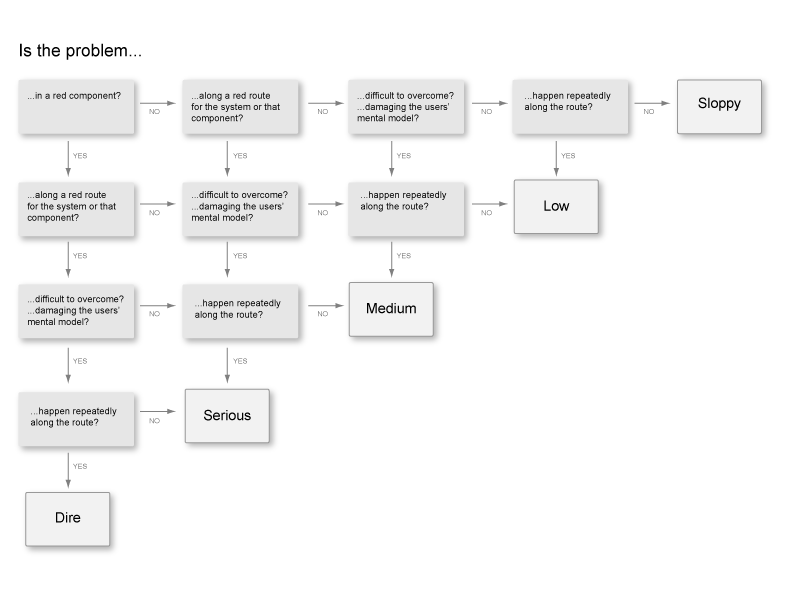
Some of the changes we made to the original framework:
- We picked more dramatic names for each severity level. “Dire” was more motivating and evocative than something like “Major.” Who wants to be the person who leaves “Sloppy” bugs in a system? Whereas “Trivial” suggests you don’t need to fix it before you even start thinking about it. ;-] We still weren’t happy with “Low” but never quite came up with something for it yet.
- We added a level of the decision tree for components. Our software product had many, many different screens, much more than your average application. As you can imagine, the 80/20 rule still applied, and users didn’t use many of them. We decided that anything on these important screens would be seen more often. That would increase how many people experienced the bug, and therefore affect more people from the get-go, even if they weren’t actively trying to use it. (They could simply be just exploring or learning about the system.)
- We also added a check for if the bug would conflict with or damage the user’s mental model of the system. Given our unusual system and its unique interaction paradigm, some bugs weren’t really that bad. Except they could give you the impression that the rules of the entire application were not what they really were. Those were dangerous issues, and so that deserved a bump up on the severity scale.
One potential weakness is:
- I have heard people suggest that frameworks like this should only have 4 levels, so that people can’t default to “Medium” all the time. We watched for this and didn’t see it happening, but it could be an issue for some.
We struggled with:
- What exactly does it mean for something to happen repeatedly? Does that mean repeatedly to one user, or across the user base? How much is too much? Is this something that pops up and happens to someone every 5 seconds, or more focused on if 60% of users encounter this step. I steered people towards the former, because the whole concept of red routes and screens is supposed to be about the size of the user base affected. But I couldn’t never find a phrasing of the question that reliably explained that angle. While this step often caused some confusion, I felt like it was less important whether someone picked YES or NO, than that they thought through who might be affected and how often.
- Because our nonlinear system has many ways for users to achieve a single goal, that certainly made judging the second step harder. Again, I felt that simply having the discussion was 1,000% closer to a good decision than we’d been before we started using the tool.
Eventually we were able to expand on this to include usability severity as a field in Bugzilla, as well as use it for planning new releases, prioritizing design team resource allocation, and charting future functionality. The tool was adopted across the board as a great way to prioritize user-facing issues.
It was better than playing my tiny violin over and over again. It was awesome.
And now something for you
Would you like to take a crack at using this tool? You can download a PDF of an updated, more abstracted version here:

Let me know if it helps you as much as it helped me. And thank you to David Travis and User Focus for bringing such amazing clarity to my life and my team for so many years!
Extra Resources
Here are a few particularly helpful resources out there, in addition to User Focus and those mentioned above, that make for great further reading.
- Measuring Usability discusses many other ratings systems, which appears expanded in the new edition. (I have the older one.) I didn’t find a systematic way of arriving at those ratings when I read the book, but I’d love to know of any other systems that are out there. Comment if you know any! I think ratings systems are a fine tool, but if you’re holding your finger up to the wind and picking one, that’s not as powerful as having a framework to get there.
- Another riff on red routes from a different angle: Red Route Usability Prioritization Flowchart. There’s also some great stuff extending the traffic metaphor as well: Traffic as Metaphor for UX Design
- Measuring U also has some great, helpful, meaty articles: